 ♪
♪


I. Traduction▲
Ceci est la traduction la plus fidèle possible de l'article de Sébastien Pertus, Create a custom user control using Xaml and C# for Windows 8Create a custom user control using Xaml and C# for Windows 8.
II. Introduction▲

Comme vous le savez, on peut facilement développer des applications natives pour Windows 8 en utilisant XAML et C# (ou encore VB.NET ;)).
Parmi beaucoup d'autres choses, XAMLnous permet de créer un contrôle personnalisé afin de factoriser notre UI.
Aujourd'hui, je souhaiterais vous montrer comment créer ce genre de contrôles et pour ce faire, je voudrais tout d'abord vous présenter la version finale du XAML Carousel Control :
Comme vous pouvez le constater, il s'agit d'un carrousel en 3D qui peut être utilisé pour afficher une longue liste d'éléments (avec un grand miroir (si vous aimez ça :)).
(Si vous souhaitez savoir comment réaliser la même chose en utilisant WinJS et HTML, vous pouvez lire l'articleCreate a custom user control using JavaScript and WinJS for Windows 8rédigé par mon collègue David Catuhe.)
Ainsi, vous vous demandez sans doute comment développer un si beau (!!) contrôle. La réponse sera décomposée en six parties :
- Comment configurer la mise en page ? ;
- Déclaration et instanciation du contrôle ;
- Utiliser des templates ;
- Utiliser le binding de données ;
- Intégrer les entrées utilisateur et des animations ;
- Optimisations.
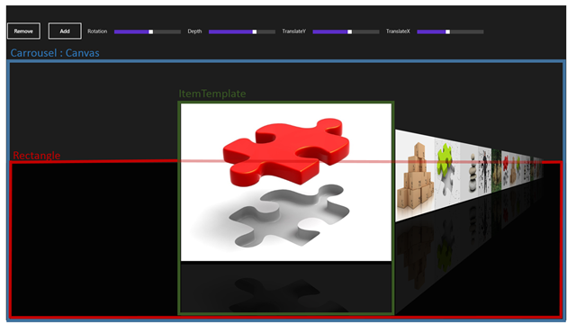
III. Configurer la mise en page▲
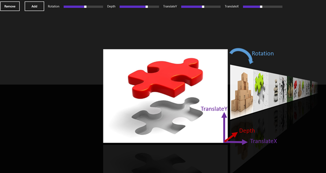
Le contrôle lui-même est construit en utilisant un Canvas, appelé Carousel. Le Carousel contient une propriété DataTemplate appelée ItemTemplate, décrivant l'aspect visuel de chaque élément du carrousel.
Dans notre exemple, vous pouvez voir que j'ai fait un miroir défini par l'image originale sur laquelle j'ai fait un CompositeTransform (ScaleY) et un PlaneProjection (RotationX).
Au final, le Carousel contient un rectangle noir qui délimite la perspective :
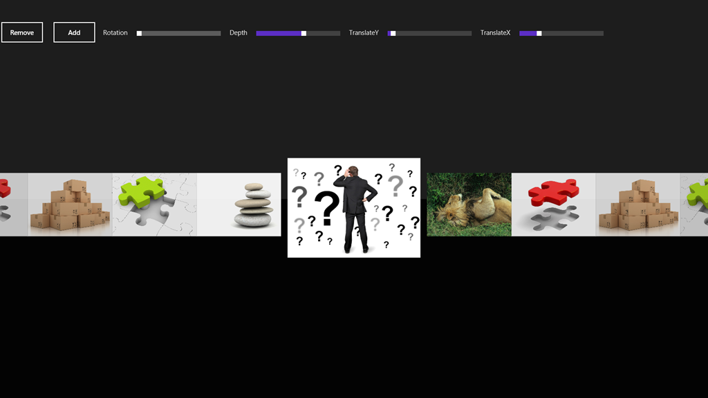
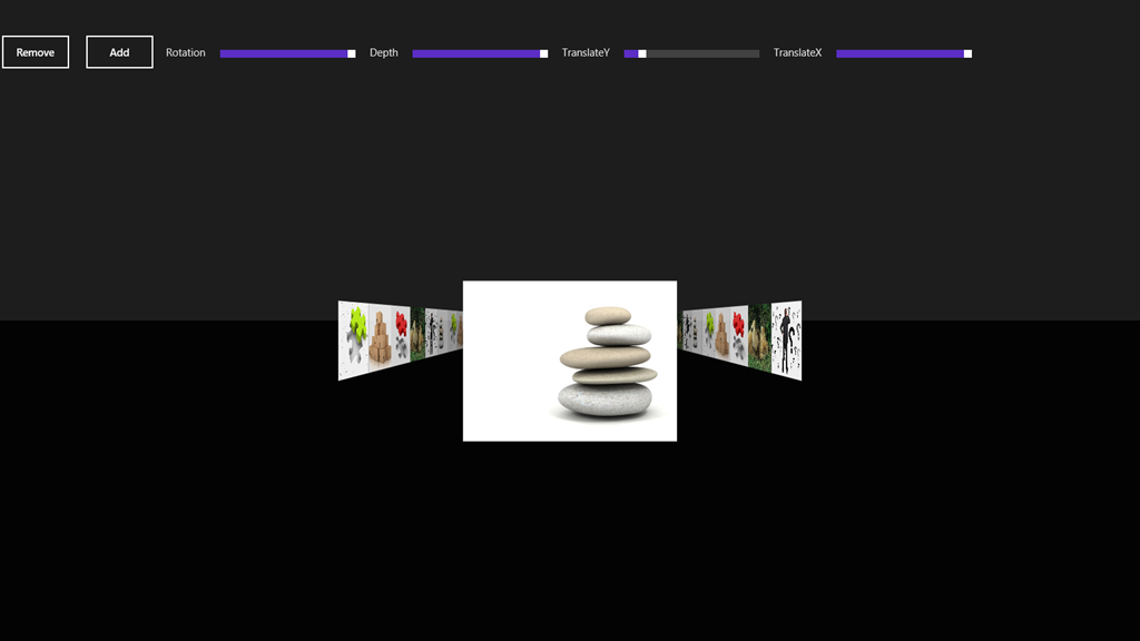
Grâce au DataTemplate et à la propriété de dépendance, vous pouvez définir le style de chaque partie du contrôle en définissant les propriétés et en déclarant un modèle d'élément.
Par exemple, voici deux styles différents : sans miroir et sans Rotation. Et un autre avec 90 ° en Rotation, ayant les propriétés Depthet TranslateXau max.
IV. Déclaration et instanciation du contrôle▲
Aussi simplement que ça :
< ctrl:LightStone />Cela dit, vous pouvez configurer plusieurs propriétés :
IV-A. ItemsSource▲
Sur le même modèle qu'une ListBox ou une ListView, vous devez configurer un ItemSource. Il vaut mieux privilégier un objet de type ObservableCollection<T> auquel vous pouvez ajouter ou supprimer des éléments pendant l'exécution de votre application (cf. la partie sur le DataBinding un peu plus loin).
IV-B. Propriétés de dépendance▲
- TransitionDuration : durée de l'animation (ms).
- Depth : profondeur sur les éléments non sélectionnés.
- Rotation : rotation des éléments non sélectionnés.
- TranslateX : translation sur l'axe X des éléments non sélectionnés.
- TranslateY : translation sur l'axe Y de tous les éléments.
IV-C. Fonction d'accélération▲
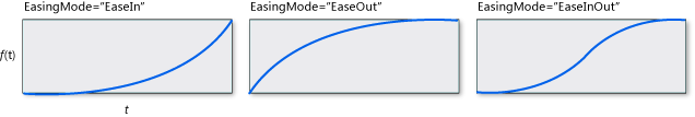
Vous pouvez configurer une fonction d'accélération pour tous les éléments. Ci-joint la documentation MSDN associée aux fonctions d'accélération pour savoir comment les utiliser.
J'ai décidé d'utiliser un CubicEase avec un mode d'accélération configuré sur « EaseOut ».
V. Templates▲
L'infrastructure Xaml fournit un moyen simple d'implémenter un ItemTemplate. Pour aller plus loin sur le sujet, vous verrez dans le code la méthode permettant d'afficher un élément lié à un DataTemplate. Il vous faut implémenter une propriété DataTemplate qui sera déclarée dans votre contrôle xaml. Dans l'exemple fourni, vous verrez que j'ai déclaré une image, et une image en miroir avec une opacité.
< ctrl:LightStone.ItemTemplate >

< DataTemplate >
< Grid >
< Grid.RowDefinitions >
< RowDefinition Height ="Auto"/>
< RowDefinition Height ="Auto"/>
</ Grid.RowDefinitions >
< Image Source ="{Binding BitmapImage}" Width ="600" VerticalAlignment ="Bottom"
Stretch ="Uniform"></ Image >
< Rectangle Grid . Row ="1" Fill ="Black" Margin ="0,10" ></ Rectangle >
< Image Grid . Row ="1" VerticalAlignment ="Top" Width ="600" Margin ="0,10"
Source ="{Binding BitmapImage}" Stretch ="Uniform"
Opacity ="0.1" >
< Image.RenderTransform >
< CompositeTransform ScaleY ="1" />
</ Image.RenderTransform >
< Image.Projection >
< PlaneProjection RotationX ="180"></ PlaneProjection >
</ Image.Projection >
</ Image >
</ Grid >
</ DataTemplate >
</ ctrl:LightStone.ItemTemplate >
V-A. Implémentation▲
La propriété ItemTemplate est un DataTemplate. En voici le code. Nous n'avons pas besoin de déclarer une propriété de dépendance, car nous ne voulons pas effectuer de modifications durant l'exécution.
/// <summary>
/// <Item Template
/// </summary>
public DataTemplate ItemTemplate
{
get
{
return itemTemplate;
}
set
{
itemTemplate = value ;
}
}
Durant la liaison, une méthode est responsable de la liaison et de l'affichage, grâce à la méthode LoadContent, qui va créer tous les UIElements :
/// <summary>
/// Bind all Items
/// </summary>
private void Bind()
{
if (ItemsSource == null )
return ;
this .Children.Clear();
this .internalList.Clear();
foreach ( object item in ItemsSource)
this .CreateItem(item);
this .Children.Add(rectangle);
}
/// <summary>
/// Create an item (Load data template and bind)
/// </summary>
private FrameworkElement CreateItem( object item, Double opacity = 1)
{
FrameworkElement element = ItemTemplate.LoadContent() as FrameworkElement;
if (element == null )
return null ;
element.DataContext = item;
element.Opacity = opacity;
element.RenderTransformOrigin = new Point(0.5, 0.5);
PlaneProjection planeProjection = new PlaneProjection();
planeProjection.CenterOfRotationX = 0.5;
planeProjection.CenterOfRotationY = 0.5;
element.Projection = planeProjection;
this .internalList.Add(element);
this .Children.Add(element);
return element;
}
VI. Liaison de données▲
Le mécanisme de liaison de données est fourni par la propriété de dépendance appelée ItemsSource.
Par ailleurs, vous devez fournir votre propre collection. Vous trouverez dans l'exemple une ObservableCollection d'objets de type Data.
Voici la classe Data(définie par un BitmapImage et un Titre)
public class Data
{
public BitmapImage BitmapImage { get; set; }
public String Title { get; set; }
}
Ci-joint la liste ObservableCollection<Data> utilisée :
public ObservableCollection<Data> Datas { get; set; }

public MainPageViewModel()
{
this .Datas = new ObservableCollection<Data>();
this .Datas.Add( new Data { BitmapImage = new BitmapImage( new Uri( "ms-appx:///Assets/pic01.jpg" , UriKind.Absolute)), Title = "Wall 05" });
this .Datas.Add( new Data { BitmapImage = new BitmapImage( new Uri( "ms-appx:///Assets/pic02.jpg" , UriKind.Absolute)), Title = "Wall 06" });
this .Datas.Add( new Data { BitmapImage = new BitmapImage( new Uri( "ms-appx:///Assets/pic03.jpg" , UriKind.Absolute)), Title = "Wall 07" });
}
VI-A. Implémentation▲
J'ai utilisé une propriété de dépendance afin d'obtenir une méthode de callback lorsque mon ItemsSource est modifié, afin d'autoriser une nouvelle liaison de données.
Remarquez le gestionnaire de la méthode ItemsSourceChangedCallback :
/// <summary>
/// Items source : Better if ObservableCollection :)
/// </summary>
public IEnumerable<Object> ItemsSource
{
get { return (IEnumerable<Object>)GetValue(ItemsSourceProperty); }
set { SetValue(ItemsSourceProperty, value ); }
}
// Using a DependencyProperty as the backing store for ItemsSource.
//This enables animation, styling, binding, etc...
public static readonly DependencyProperty ItemsSourceProperty =
DependencyProperty.Register( "ItemsSource" ,
typeof (IEnumerable<Object>),
typeof (LightStone),
new PropertyMetadata(0, ItemsSourceChangedCallback));
Le ItemsSourceChangedCallback me permet d'implémenter mon propre mécanisme lorsque j'ajoute ou supprime un ou plusieurs éléments :
private static void ItemsSourceChangedCallback(DependencyObject dependencyObject, DependencyPropertyChangedEventArgs args)
{
if (args.NewValue == null )
return ;
if (args.NewValue == args.OldValue)
return ;
LightStone lightStone = dependencyObject as LightStone;
if (lightStone == null )
return ;
var obsList = args.NewValue as INotifyCollectionChanged;
if (obsList != null )
{
obsList.CollectionChanged += (sender, eventArgs) =>
{
switch (eventArgs.Action)
{
case NotifyCollectionChangedAction.Remove:
foreach (var oldItem in eventArgs.OldItems)
{
for ( int i = 0; i < lightStone.internalList.Count; i++)
{
var fxElement = lightStone.internalList[i] as FrameworkElement;
if (fxElement == null || fxElement.DataContext != oldItem) continue ;
lightStone.RemoveAt(i);
}
}
break ;
case NotifyCollectionChangedAction.Add:
foreach (var newItem in eventArgs.NewItems)
lightStone.CreateItem(newItem, 0);
break ;
}
};
}
lightStone.Bind();
}
VII. Saisies utilisateurs et animations▲
VII-A. Saisies▲
Afin de répondre aux saisies des utilisateurs, il vous suffit de gérer les événements du pointeur.
Remarque : Pour aller plus loin, vous pouvez utiliser le GestureRecognizer, mais dans cet exemple nous souhaitons juste gérer des gestes simples.
Le principe est simple : si l'utilisateur déplace son doigt/souris/stylet sur plus de 40pixels, on peut changer l'élément courant en fonction de la direction du mouvement.
Voici le code :
/// <summary>
/// Initial pressed position
/// </summary>
private void OnPointerPressed( object sender, PointerRoutedEventArgs args)
{
initialOffset = args.GetCurrentPoint( this ).Position.X;
}
/// <summary>
/// Calculate Behavior
/// </summary>
private void OnPointerReleased( object sender, PointerRoutedEventArgs pointerRoutedEventArgs)
{
// Minimum amount to declare as a manipulation
const int moveThreshold = 40;
// last position
var clientX = pointerRoutedEventArgs.GetCurrentPoint( this ).Position.X;
// Here is a "Tap on Item"
if (!(Math.Abs(clientX - initialOffset) > moveThreshold))
return ;
isIncrementing = (clientX < initialOffset);
// Here is a manipulation
if (clientX < initialOffset)
{
this .SelectedIndex = ( this .SelectedIndex < ( this .internalList.Count - 1))
? this .SelectedIndex + 1
: this .SelectedIndex;
}
else if ( this .SelectedIndex > 0)
{
this .SelectedIndex--;
}
initialOffset = clientX;
}
J'ai utilisé une autre méthode pour répondre à l'événement tactile (pas pour un geste, mais pour l'action "clic")
Pour obtenir le bon élément sur lequel nous avons cliqué, j'ai utilisé la méthode UIElement.TransformToVisual qui retourne un objet transformé pouvant être utilisé pour modifier les coordonnées depuis l'objet UIElement :
var rect = child.TransformToVisual( this ).TransformBounds( new Rect(0, 0, child.DesiredSize.Width, child.DesiredSize.Height));
Voici la méthode complète :
/// <summary>
/// Tap an element
/// </summary>
private void OnTapped( object sender, TappedRoutedEventArgs args)
{
var positionX = args.GetPosition( this ).X;
for ( int i = 0; i < this .internalList.Count; i++)
{
var child = internalList[i];
var rect = child.TransformToVisual( this ).TransformBounds( new Rect(0, 0, child.DesiredSize.Width, child.DesiredSize.Height));
if (!(positionX >= rect.Left) || !(positionX <= (rect.Left + rect.Width))) continue ;
isIncrementing = (i > this .SelectedIndex);
this .SelectedIndex = i;
return ;
}
}
VII-B. Animations▲
La transition entre chaque élément est assurée par une fonctionnalité assez sympathique disponible sur chaque UIElement : le UIElement.Projection.
Projection permet d'obtenir ou d'attribuer la perspective en 3D à appliquer lorsque l'on affiche l'élément. Lorsque vous appliquez une projection, vous pouvez choisir entre une Matrix3DProjection ou une PlaneProjection. Dans cet exemple, j'ai utilisé la PlaneProjection.
Chaque élément sera animé des propriétés de sa PlaneProjection. Selon les propriétés de dépendance que vous aurez fournies dans votre contrôle xaml bien entendu :)
Grâce au mécanisme d'Animation de XAML, nous pourrons animer tous les éléments avec un seul StoryBoard :
/// <summary>
/// Update all positions. Launch every animations on all items with a unique StoryBoard
/// </summary>
private void UpdatePosition()
{
if (storyboard.GetCurrentState() != ClockState.Stopped)
{
storyboard.SkipToFill();
storyboard.Stop();
storyboard = new Storyboard();
}
isUpdatingPosition = true ;
for ( int i = 0; i < this .internalList.Count; i++)
{
var item = internalList[i];
PlaneProjection planeProjection = item.Projection as PlaneProjection;
if (planeProjection == null )
continue ;
// Get properties
var depth = (i == this .SelectedIndex) ? 0 : -( this .Depth);
var rotation = (i == this .SelectedIndex) ? 0 : ((i < this .SelectedIndex) ? Rotation : -Rotation);
var offsetX = (i == this .SelectedIndex) ? 0 : (i - this .SelectedIndex) * desiredWidth;
var translateY = TranslateY;
var translateX = (i == this .SelectedIndex) ? 0 : ((i < this .SelectedIndex) ? -TranslateX : TranslateX);
// CenterOfRotationX
// to Get good center of rotation for SelectedIndex, must know the animation behavior
int centerOfRotationSelectedIndex = isIncrementing ? 1 : 0;
var centerOfRotationX = (i == this .SelectedIndex) ? centerOfRotationSelectedIndex : ((i > this .SelectedIndex) ? 1 : 0);
planeProjection.CenterOfRotationX = centerOfRotationX;
// Dont animate all items
var inf = this .SelectedIndex - (MaxVisibleItems * 2);
var sup = this .SelectedIndex + (MaxVisibleItems * 2);
if (i < inf || i > sup)
continue ;
// Zindex and Opacity
var deltaFromSelectedIndex = Math.Abs( this .SelectedIndex - i);
int zindex = ( this .internalList.Count * 100) - deltaFromSelectedIndex;
Canvas.SetZIndex(item, zindex);
Double opacity = 1d - (Math.Abs((Double)(i - this .SelectedIndex) / (MaxVisibleItems + 1)));
var newVisibility = deltaFromSelectedIndex > MaxVisibleItems
? Visibility.Collapsed
: Visibility.Visible;
// Item already present
if (item.Visibility == newVisibility)
{
storyboard.AddAnimation(item, TransitionDuration, rotation, "(UIElement.Projection).(PlaneProjection.RotationY)" , this .EasingFunction);
storyboard.AddAnimation(item, TransitionDuration, depth, "(UIElement.Projection).(PlaneProjection.GlobalOffsetZ)" , this .EasingFunction);
storyboard.AddAnimation(item, TransitionDuration, translateX, "(UIElement.Projection).(PlaneProjection.GlobalOffsetX)" , this .EasingFunction);
storyboard.AddAnimation(item, TransitionDuration, offsetX, "(UIElement.Projection).(PlaneProjection.LocalOffsetX)" , this .EasingFunction);
storyboard.AddAnimation(item, TransitionDuration, translateY, "(UIElement.Projection).(PlaneProjection.GlobalOffsetY)" , this .EasingFunction);
storyboard.AddAnimation(item, TransitionDuration, opacity, "Opacity" , this .EasingFunction);
}
else if (newVisibility == Visibility.Visible)
{
// This animation will occur in the ArrangeOverride() method
item.Visibility = newVisibility;
item.Opacity = 0d;
}
else if (newVisibility == Visibility.Collapsed)
{
storyboard.AddAnimation(item, TransitionDuration, rotation, "(UIElement.Projection).(PlaneProjection.RotationY)" , this .EasingFunction);
storyboard.AddAnimation(item, TransitionDuration, depth, "(UIElement.Projection).(PlaneProjection.GlobalOffsetZ)" , this .EasingFunction);
storyboard.AddAnimation(item, TransitionDuration, translateX, "(UIElement.Projection).(PlaneProjection.GlobalOffsetX)" , this .EasingFunction);
storyboard.AddAnimation(item, TransitionDuration, offsetX, "(UIElement.Projection).(PlaneProjection.LocalOffsetX)" , this .EasingFunction);
storyboard.AddAnimation(item, TransitionDuration, translateY, "(UIElement.Projection).(PlaneProjection.GlobalOffsetY)" , this .EasingFunction);
storyboard.AddAnimation(item, TransitionDuration, 0d, "Opacity" , this .EasingFunction);
storyboard.Completed += (sender, o) =>
item.Visibility = Visibility.Collapsed;
}
}
// When storyboard completed, Invalidate
storyboard.Completed += (sender, o) =>
{
this .isUpdatingPosition = false ;
this .InvalidateArrange();
};
storyboard.Begin();
}
Pour le rendre plus simple et plus facile à utiliser, vous trouverez une méthode d'extension permettant de définir un DoubleAnimation directement sur un StoryBoard :
public static void AddAnimation( this Storyboard storyboard, DependencyObject element,
int duration, double fromValue, double toValue, String propertyPath,
EasingFunctionBase easingFunction = null )
{
DoubleAnimation timeline = new DoubleAnimation();
timeline.From = fromValue;
timeline.To = toValue;
timeline.Duration = TimeSpan.FromMilliseconds(duration);
if (easingFunction != null )
timeline.EasingFunction = easingFunction;
storyboard.Children.Add(timeline);
Storyboard.SetTarget(timeline, element);
Storyboard.SetTargetProperty(timeline, propertyPath);
}
VIII. Optimisations▲
Enfin, juste pour être sûr que notre contrôle fonctionne bien sur du matériel bas de gamme, nous devons nous assurer que seuls les éléments visibles sont effectivement gérés par le contrôle, et par la même occasion n'animer que les éléments visibles.
Pour atteindre cet objectif, il nous faut enlever les éléments du contrôle lorsque leur opacité est inférieure ou égale à 0. Bien évidemment, vous devez les réinsérer lorsqu'ils deviennent à nouveau visibles.
/// Dont animate all items
var inf = this .SelectedIndex - (MaxVisibleItems * 2);
var sup = this .SelectedIndex + (MaxVisibleItems * 2);
if (i < inf || i > sup)
continue ;
// Get if item is visible or not
var newVisibility = deltaFromSelectedIndex > MaxVisibleItems
? Visibility.Collapsed
: Visibility.Visible;
Dans la méthode ArrangeOverride, nous pouvons vérifier si un élément apparaît ou pas :
// Items appears
if (container.Visibility == Visibility.Visible && container.Opacity == 0d)
{
localStoryboard.AddAnimation(container, TransitionDuration, rotation, "(UIElement.Projection).(PlaneProjection.RotationY)" , this .EasingFunction);
localStoryboard.AddAnimation(container, TransitionDuration, depth, "(UIElement.Projection).(PlaneProjection.GlobalOffsetZ)" , this .EasingFunction);
localStoryboard.AddAnimation(container, TransitionDuration, translateX, "(UIElement.Projection).(PlaneProjection.GlobalOffsetX)" , this .EasingFunction);
localStoryboard.AddAnimation(container, TransitionDuration, offsetX, "(UIElement.Projection).(PlaneProjection.LocalOffsetX)" , this .EasingFunction);
localStoryboard.AddAnimation(container, TransitionDuration, translateY, "(UIElement.Projection).(PlaneProjection.GlobalOffsetY)" , this .EasingFunction);
localStoryboard.AddAnimation(container, TransitionDuration, 0, opacity, "Opacity" , this .EasingFunction);
}
else
{
container.Opacity = opacity;
}
Vous trouverez le code complet iciici.
Amusez-vous bien !
IX. Remerciements▲
Je tiens à remercier Sébastien Pertus pour son aimable autorisation de traduire cet article, ainsi que Claude Leloup et Thomas Levesque pour leur relecture attentive et leurs corrections.